The brief for my A2 Media coursework was:
A promotional package for a new film, to include a teaser trailer, together with two of the following three options:
• A website homepage for the film;
• A film magazine front cover, featuring the film;
• A poster for the film.
For this particular coursework I chose to do a film trailer. I also had to produce two ancillary texts in which we had three to choose from, these were a poster promoting my trailer, a film magazine front cover and a website. I chose to do the poster and the film magazine front cover. Technologies such as the internet were a huge benefit to me whilst making my coursework. I used many websites to research codes and conventions of horror, film clips and trailers, music, magazine front covers and film posters. I chose not to challenge forms and conventions of real media products as I wanted to create something known well and recognized by audiences. My product was based around the stereotypical conventions of the horror film genre.
I began by choosing the genre for my trailer. I decided to do a horror trailer as I felt I knew the conventions better then other genres such as romance or comedy. I then began to research the conventions and stereotypes for horror genre. Using Google and Wikipedia websites I searched for codes and conventions of horror and the results I found were then posted on my blog 15.11.10 (www.paigedrewry@blogspot.com). I found that darkness, vulnerable characters, open spaces and unfamiliar locations were all conventions of horror films. I made a note of this on Microsoft word and then posted it on my blog so I could use this for my filming. I then chose a target audience for my trailer which I based around my own age, the target audience I chose was people aged 16 – 24. I felt by doing this I would be able to produce a piece of work to suit this audience as I knew what people around that age would find entertaining and scary. After doing this I then began to think of potential storylines for the film. I watched and analyzed trailers such as ‘se7en (David Fincher, 1995)’ and ‘The Exorcist (William Friedkin, 1971)’ using the website YouTube. These were also posted on my blog and for further research I looked at other students A2 work also on YouTube. Because of my research I was able to see what good horror films contained and tried to incorporate them into my storyline. In the end I decided on a binary opposed storyline using the theory by Claude Lévi-Strauss and began to decide on the angles, characters, locations and dialogue I would use.
After more research on conventions of Horror I decided I would not use dialogue in my work as after reading the conventions I decided it would create more suspense as without sound the silence would convey as eerie. I used Microsoft word to write down my ideas and then posted these ideas on my blog. Because my trailer was based on religion I used the Bible for quotes. I decided to use conventional horror structure for my trailer and had the antagonist played by a male and the protagonist played by a female. Because of the male and female role in my trailer I used the Adam and Eve biblical story to take my quotes from. The storyline was based on a man blaming women for the temptation of men so to show this I picked the quote; ‘She gave me of the tree and I did not’. I also chose to call my film Temptation as this was what the trailer was based around.
My media product was designed to conform to the stereotypical horror conventions. I wanted the active audience to understand the genre chosen and to enjoy a ‘classic’ horror piece. Because of the unfamiliar locations and storyline chosen I felt my product would reflect a real media product. I chose to cast a male and female who I knew were good actors for my trailer. Both had previously done drama as a course and because there was no dialogue I was confident that it would look as good as it could. The male was 18 and I chose him because I felt his appearance would be easy to create a mysterious look with. The girl was 17 and by making her younger it showed her more vulnerable to the audience. Also the characters age aligned her with the audience as they would be able to relate to her as she was around a similar age. Once the actors were decided on I then went on to finding music for the background of the trailer. To do this I went onto YouTube and searched for ‘Horror movie soundtracks’ I listened to ones I thought would suit with my chosen genre ‘Awesome Classical Music’ and ‘Classic Horror Soundtracks’, when I found one I thought would work I then downloaded it onto my flash drive. Once I had done this I had over 40 minutes of sound to use on my work. Using Microsoft word I began to list different possible locations to shoot my trailer, this was then posted on my blog with a shortlist of a church, graveyard, woodland and a garage.
For Mise En Scene I based the props around the religious theme of the trailer and chose to use a rosary and a bible. Costumes were picked to suit with the horror genre and stereotypically I dressed the antagonist in all black. The victim would be wearing normal clothes for a 17 year old girl for one scene and then would change into a slashed blooded white top for the second scene. I felt as though the stereotypical clothing for teenage girls would show a normal side to the character; using a white slashed t-shirt I thought, would show a pure and vulnerable look. I dressed and styled the antagonist to look mysterious as possible using black trousers, a black coat and a white shirt which connotes a typical look for an antagonist. Black creates mystery and curiosity which is why I chose to dress him this way.
Once the locations, characters, props and clothing were decided on I then began to draw my storyboard. On my storyboard I drew a picture of the scene wrote how long it would last for, the angles I would use and then gave a brief description of the scene. Once I had done this I then scanned the storyboard onto my computer and then posted it on Blogger. Before I started my filming I used Google and Google images to research and analyze film front covers and film posters. This would help me with my ancillary texts. When I was ready to film and had chosen my definite locations (Church, woodland and garage) I rented a handheld digital camera from the college and started off with a blank tape. I decided to use a handheld camera as it was portable and easy to carry around. Also I felt it would be better for the horror film ‘shaky’ effect which connotes realism to the audience. I could easily attach the camera to a tripod so I also had two different ways of filming my trailer.
For Mise en’ Scene I chose a vast church in the middle of the city centre as I knew it had many interesting things I could film and the huge size of it meant I could get more out of my shots. I then decided on which parts of the church I would film and using my storyboard began to film what I had drawn. Things weren’t as easy as I thought and I had to experiment with different camera angles such as medium close up to get the shot I wanted. As well as filming my antagonist I also filmed religious images in the church such as windows, painting and statues to keep with the religious film. That day I shot 20 minutes of footage which I then took back to college and uploaded it up onto the edit suite computers.
Looking back at the footage I had taken I decided that the lighting was too bright to use. I had gone to the church on a sunny day and the light from the windows had caused the shots to look unusual and not typical for a horror film. It was then I decided I needed to reshoot the church scenes and to go on a night time where the light wouldn’t be a problem. Again I rang up the church and organized another shoot for a night time. In the meantime I used to program Adobe Premier and used the ‘capture’ tool to upload my video and enable me to take the parts I needed. I used the blade tool to cut my clips shorter so I could edit them more easily. The non linear editing meant I could arrange clips in which ever way I wanted which enabled me to edit better. I then started to piece together the clips I wanted to keep. I then returned to the church with the antagonist dressed in the same clothes as before, this was for continuity reasons. The lighting was much darker this time and I also used the artificial lighting in the church to create the dark look I wanted. This time I filmed another 15 minutes of footage using different angles and rethinking scenarios. This time I didn’t stick to my original plan on my storyboard and decided to film other scenes which I thought would look good.
After the nighttime shoot I again uploaded my footage onto the Adobe Premier Programme and decided I was happy with the shots. After this I had two more scenes to shoot and decided to do them in one day. These two scenes were to be shot in a garage and in a woodland. It was around 4pm when myself and my two actors went to the woodland to start filming. However things didn’t go to plan as it was too dark to shoot so I couldn’t film outside that night, I then decided to do just the garage shoot instead and film the woodland scene another day. For this scene my antagonist stayed in the same clothing but my victim had different clothes on from which she would have done in the woodland scene. For a horror look I tied the victim to the chair using rope and experimented with different lighting. I tried swinging a light to see how that looked and thought it would really work. The lighting I used in the garage was this particular style and when I looked back at the footage I didn’t need to reshoot it.
I still needed to shoot my last scene and I decided to film on a time where it wouldn’t be too dark or too bright, I wanted the woodland to look dark so I didn’t want it to be too bright when I shot the scene. This was to keep to the convention of typical horror darkness and to keep it as an occurring theme in my work. In the woodland I used mostly close up shots and zoomed in shots to create and intense look, I would speed these shots up on the editing suite to create a more on edge look and uncomfortable feeling when watching. After filming this scene I had 40 minutes footage all together and finally had enough to create my trailer with.
When I’d uploaded all my footage onto the editing suite I picked out and ‘captured’ all the shots I knew would appeal to my target audience and would stick to the stereotypical horror conventions. After selecting the shots I would use I then began to edit and put them together. Using the drag tool I selected the shots I wanted and dragged them onto the timeline on the Adobe software. I used dissolves and edit transitions to make my work look more professional. I also darkened some shots that I thought were to bright using the brightness/contrast tool in the Adobe Programme. After putting the shots together I realized that some parts didn’t look right or didn’t fit in. I then had to rearrange the shots and use some other footage to finally make it look the way I wanted it too.
When I had finished rearranging and creating my trailer I then needed to add sound. This was the most difficult part for me as I had put my clips on first so I needed to match the sound to the movements. Using the music I had downloaded off YouTube I downloaded it onto the editing suite and then began to listen to see which bits I would select for my trailer. After deciding on which sounds to use I then cut down the sound with the cropping tool, this enabled me to put only the sounds I thought would work onto my trailer. After doing this I then started work on my ancillary texts.
I first started by creating the magazine front cover. I chose the colour scheme of red and black as these were typical horror colours. Red signifying blood and danger and black creating dark moods and tones. I didn’t take any new photos for the magazine and picked an image from my trailer which I thought would be the most iconic. The still I used was a close up of my victim with a gag in her mouth. I turned this photo black and white to make it look more frightening and then I started on the text for the magazine. I looked back at my research for magazine front covers which I’d done earlier in the year and used this to help me create my text. Using Google search engine I found different styles of horror fonts I could use for my banners on the magazine. I wanted to keep the poster simple so again I used the same image turning it black and white and just displayed the title including the release date on.
I feel as though my main product and ancillary texts are extremely effective as they both relate to one another. By using a still from the actual trailer in both my ancillary texts creates an image that the audience will remember. By not displaying the antagonist in my ancillary texts it creates more mystery around the trailer making the audience more curious to watch it. By sticking to the typical codes and conventions of horror films in all three pieces of my work I feel that the audience will have a great understanding of the genre of Horror I have used. Although I have not challenged forms and conventions of real media I have tried to use stereotypical horror conventions to create a text that all audiences will find familiar. This is things such as unfamiliar locations, black and dark imagery and a female victim.
Both my main product and ancillary texts work together as they do not differ from one another. My ancillary texts both display a still from the trailer and I tried to do this to make the audience more eager to see the trailer. I carried the dark imagery throughout all texts using black colours, shots and images in each piece of work, I also used the same font throughout. This creates continuity and means the audience can link all three texts together as they relate to one another.
Looking back at my finished products I realised I could have made my trailer a lot better by re thinking a different storyline. Although my work was based around religion I believe a clearer plot would have enabled my video to work a lot better. I asked a group of friends for their feedback using a questionnaire I had made. I used people with a similar age of my target audience (17 – 19) to get a better understanding of what people that age want. Their results said that although they believed my trailer was good it could have been better by creating a clearer storyline. They also said that the sound could have worked better as I used 4 different tracks together to create one. However they believed the shots I used had worked well and that the mise en scene I had used worked for my chosen genre. If I had to do this again I would re think a clearer storyline and use my peers for advice as they were the bases of my target audience. I would also try to find a wider range of tracks to use choosing ones which justified my genre better.
Friday, 15 April 2011

Finished trailer
This is my finished trailer for my A2 Media film Temptation.
http://www.youtube.com/watch?v=5fxugG45T_E
http://www.youtube.com/watch?v=5fxugG45T_E
Ancillarys
These are my finished ancillary texts. I used the same font and same images for both texts as I felt they would relate with each other and show similarities. I used colours such as red and black as they are conventions of horror and I used fonts which people would instantly relate horror too.
The main image I used was cut from my trailer.I did this purposfully to create an image on my ancillary texts which the audience could relate to the film.


The main image I used was cut from my trailer.I did this purposfully to create an image on my ancillary texts which the audience could relate to the film.


Wednesday, 6 April 2011
Conventions of film trailers
Film trailers are made to keep the audience in suspense and to make them want to go to watch the film at the cinema. A trailer shows the best parts from the film yet shows no twists or the ending which keeps the audience wanting to see more and it persuades them to go watch the movie.
Thursday, 17 March 2011
This is the first draft of my trailer which is nearly finished. My text only needs to have more sound put on and then it will be finished. This piece I have on my flash drive hasn't saved properly and my work on the editing suite is different to this. Some text hasn't appeared and neither has some transitions made. However this video gvies an impression as to what my film is about and what it will look like when it's been finished.
Ancillary Texts
This is the first of my ancillary texts which is a film magazine front cover, this text is not fully finished but I only have a few extra things to add to it to fill in the white spaces. I used a lot of red and white in this text to convey the stereotypical horror convention of red = blood. I also used blacks to create a darker image. I used the internet to find different fonts for the 'Horror Edition' at the top of the page to make it look more original and used a font in which the audience would relate to horror. I used typical convetions of magazines for example, main image, masthead, date and price to make it look more professional.


Monday, 13 December 2010
Clips.
This video is 3 different clips I have edited together to show what didn't work with a shoot. The first 2 shots are a high angled image of a tree. I used a tree as I thought that it showed vunrability because it was on its own. Both shots were too dark which made it hard to use in my video because of this I had to retake the shots and the new shot was the one I used in my film trailer. The tree's in my opinion are a typical convention of horror movie trailers that have a sub genre of action. Action usually means outdoors so showing the tree's is showing nature/outdoors. The second tree shot was still dark however I also didn't use this clip as you could see the outline of the lamp-post behind it which meant it wasn't so isolated as I wanted it to be. The 3rd peice of footage I shot was in a garage and I shot the window. I wanted to show this as I wanted to establish the setting I was in. I also panned the camera when filming this shot but I didn't think it worked aswell as I thought it would. I decided not to use this shot as I didn't think it looked professional enough and it was also to dark to use in my trailer. I decided not to reshoot this shot as I didn't think it was really relevent in my trailer.
The reason all images were dark was because of complications with timing. I realised I had to rethink what time to shoot and when myself and others were available for filming. After I had done this I planned a time when I knew all my cast where available and when it was light enough to shoot. These shots were the ones I have used in my trailer.
Friday, 10 December 2010
I have finished all my filming and am now editing my work on the programme 'Adobe Premire Pro'. I am finding the programme easy to use and the layout is simplistic yet professional. What I'm finding difficult is the timeline and how to get my clips into the order I think they should be in. However if I make a decision and want to change it the programme allows me to do this easily. My clips are all shown in the left hand corner of the screen and it is easy to get them onto the timeline as all I have to do is drag the clip were I want it to appear and it comes up. I am finding that I can get a lot of work done in the time provided in lessons. Although I haven't finished my trailer yet I think I will be able to finish it by the deadline set (17th Decemeber). I now need to upload the music for my trailer onto the programme and fit the music to the clips I have used. I also want to create my own film image so that I can use an original one at the beginning of the trailer rather than copying someone elses. This will make it more individual and will show I have put more effort into my work.
Donnie Darko poster analysis

This poster is an intersting and modernistic poster. The title of the film is the name of the character who dominates the whole movie. The main image is made up of this particular character and the other characters who star in it make up the characters face. This idea is a totally unique way of presenting a film poster and it shows the films idea yet establishes the charcters within it. The colours of the poster are black and blue and this is what establishes the genre of the film which is horror with the sub genre of thriller. The poster is symetrical and the layout is well centered. The title of the film is clearly shown underneath the main image.
Monday, 29 November 2010
Target Audience
My target audience will be for an audience aged 15 and above. This is because the material in my trailer will be quite disturbing for any person lower than that age. My audience will be people who enjoy watching films and quite often go to the cinema. I will give my trailer a 15 certification meaning that no person under this age will be able to watch the film.
Because my film has no romance involved people who like the romantic genre of film would not come to watch it. The people I will aim the film at will be people who enjoy watching horror films.
The gender for my film will be both men and woman but I think more men would like to watch my film rather than women. I think my film would be viewed mostly by partners or friends going to watch the film at the cinema. I think mostly working class people would watch this film. Working class people also make up most of the population so it would mean most of the population would be tempted to watch my film.
Because my film has no romance involved people who like the romantic genre of film would not come to watch it. The people I will aim the film at will be people who enjoy watching horror films.
The gender for my film will be both men and woman but I think more men would like to watch my film rather than women. I think my film would be viewed mostly by partners or friends going to watch the film at the cinema. I think mostly working class people would watch this film. Working class people also make up most of the population so it would mean most of the population would be tempted to watch my film.
Tuesday, 23 November 2010
Film Posters.

This poster shows a close up of a well known and established character of the Harry Potter films. Ron Weasley has been in all Harry Potter films and is well known around the world. The image in this text is simplistic yet effective as it gives the audience an idea towards what the film will actually be like. The photo is dark which gives us a clue that the film won't be light hearted one like the other 6.
The close up of the character gives a serious interpretation to the film especially as the character isn't smiling on the photograph.
The text explaining the poster all together doesn't even need to be bigger than the photo itself as the image on the poster is so well known it would work without even putting text on it. The date is also extremely small on this poster but because the release is so anticipated the audience would pay attention to it.

This poster clearly shows the title of the film and the actors which star in it. The poster is quite bright and colourful which will attract the attention of the audience. The 2 characters are shown in a close up and by looking at the poster we get an idea that these two are romanticaly linked and that they are the main characters. Straight away we can see the romantic feel and because of this people who are more likely to watch the romance genre of film will be more drawn to it than people who will go to watch horror films. The colours shown on the poster are pastel colours and quite stereotypically girly. Because of this and the romantic link shown I think girls would be more likely to go and watch this film than males. However I think many females would go with their partners to watch this movie. Both characters are extremely attractive and the audience will see this too. Girls would like to realte themselves to the female character and they would also be attracted to the male. This may work the other way around with the males wanting to be like the male character and finding themselves attracted to the leading lady.
Monday, 22 November 2010
So far I have filmed in 3 locations and when looking back at my tape only one of the locations was good enough to not shoot again. This is the scene which I shot in the garage. The church location was too bright for my horror genre so I have had to reschedule a re-shoot. Also some of the shots were too shakey and I had not produced the angle I need.
The scene were I need to be in woodland has also needed to be rescheduled as when I went to film it was too dark to have good quality shots. I have had to rethink the way I want the shot to look and which angles I need to use as when looking back at my tape I realised some of the shots didn't look quite as I wanted them too.
I changed my mind on the cemetary scenes as I believe woodland would look much better and I also didn't want to disrespect anyone.
The scene were I need to be in woodland has also needed to be rescheduled as when I went to film it was too dark to have good quality shots. I have had to rethink the way I want the shot to look and which angles I need to use as when looking back at my tape I realised some of the shots didn't look quite as I wanted them too.
I changed my mind on the cemetary scenes as I believe woodland would look much better and I also didn't want to disrespect anyone.
Monday, 15 November 2010
Conventions of the horror genre.
Horror films are made to scare and to panic the audience. There are different types of horror films such as psychological horror, thriller and fantasy films. When people watch horror films they are there to be entertained. When watching a horror peoples worst fears are invoked and the audiences mind is being played on.
Horror films are made to play on peoples minds; they often include a story line which the audience can relate too. Horror’s often have underlying messages and because the audience see some truth in the storyline it scares them more as they believe there is a possibility that it could happen. There are often other genres included within the horror genre. In the majority of films there is always a ‘Cinderella theme’, this is where there is a romance involved within the story. Film makers know what sells and they incorporate these themes and genres creating a sub genre.
Horror films were created at least 100 years ago and the very first horror films included fantasy creatures such as vampires and monsters. Horror films often contain sex but within the film sex is seen as wrong and the characters in these films often pay for the acts. This is another convention used within the horror genre. Previously Horror films were just based around monsters and indescribable creatures, now in the modern age these films include ‘normal’ people playing victims and protagonists which brings a reality to the film and it’s taken away from fantasy. Statistically one of the scariest horror films of all time is ‘The Exorcism’. This film shows a young girl being possessed by the devil/demons. This film had people crying and fainting because of this at the cinema. The film was that shocking to some that it was banned from England and Priests stood outside the cinema blessing people and asking people not to go and watch it. After this many film producers included religion into horrors making Religion another convention within the horror genre.
Horror films are at the top of the highest grossing genre within films and there is a new horror brought out at least once a month. The makers of these films know audiences like to be scared and this is why these films are mass produced. The majority of horrors don’t even come out at the cinema and many are just released onto DVD straight away. Jurassic Park is the highest grossing horror film so far. Although this film has many sub genres such as Sci Fi and Thriller because it also has horror as a genre it makes it the highest grossing horror film.
I have decided to use horror as my chosen genre as it is the genre most people like to watch. People love to be scared and horror conventions draw people in. The horror genre also fits in with my target audience and is my favourite type of film. Because I have watched many horror films I feel as though I can take ideas off the films I have watched and can understand the conventions and the genre more. I also think by doing a horror trailer it will be more challenging and more interesting to make. The effects I want need to be created by the camera movements, sounds and lighting I choose so I feel it will be a bigger challenge and one that communicates with the audience more.
Horror films are made to play on peoples minds; they often include a story line which the audience can relate too. Horror’s often have underlying messages and because the audience see some truth in the storyline it scares them more as they believe there is a possibility that it could happen. There are often other genres included within the horror genre. In the majority of films there is always a ‘Cinderella theme’, this is where there is a romance involved within the story. Film makers know what sells and they incorporate these themes and genres creating a sub genre.
Horror films were created at least 100 years ago and the very first horror films included fantasy creatures such as vampires and monsters. Horror films often contain sex but within the film sex is seen as wrong and the characters in these films often pay for the acts. This is another convention used within the horror genre. Previously Horror films were just based around monsters and indescribable creatures, now in the modern age these films include ‘normal’ people playing victims and protagonists which brings a reality to the film and it’s taken away from fantasy. Statistically one of the scariest horror films of all time is ‘The Exorcism’. This film shows a young girl being possessed by the devil/demons. This film had people crying and fainting because of this at the cinema. The film was that shocking to some that it was banned from England and Priests stood outside the cinema blessing people and asking people not to go and watch it. After this many film producers included religion into horrors making Religion another convention within the horror genre.
Horror films are at the top of the highest grossing genre within films and there is a new horror brought out at least once a month. The makers of these films know audiences like to be scared and this is why these films are mass produced. The majority of horrors don’t even come out at the cinema and many are just released onto DVD straight away. Jurassic Park is the highest grossing horror film so far. Although this film has many sub genres such as Sci Fi and Thriller because it also has horror as a genre it makes it the highest grossing horror film.
I have decided to use horror as my chosen genre as it is the genre most people like to watch. People love to be scared and horror conventions draw people in. The horror genre also fits in with my target audience and is my favourite type of film. Because I have watched many horror films I feel as though I can take ideas off the films I have watched and can understand the conventions and the genre more. I also think by doing a horror trailer it will be more challenging and more interesting to make. The effects I want need to be created by the camera movements, sounds and lighting I choose so I feel it will be a bigger challenge and one that communicates with the audience more.

Locations.
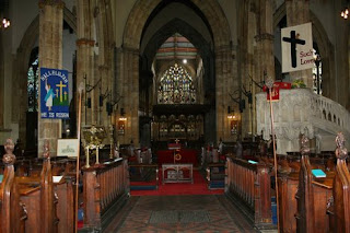
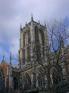
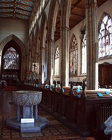
The locations I have chosen for my film trailer are: The Holy Trinity Church, Chantserland Avenue Cemetary and a home garage. I have chosen the church because it has a very old and creepy feel and is something with a lot of character in which I could film a lot of different scenes has it has so much detail. The church is located in the middle of town so will be easy to get too, i have also rang up the church and asked for their permission to film there with which they said yes.


Tuesday, 9 November 2010
Sound for my trailer
Because I need a soundtrack to go with my horror trailer I searched for music on YouTube to fit with the horror genre. I found a few soundtracks that i will cut and use when appropraite during the trailer. These are the soundtracks I will cut my music from
First Choice Soundtrack - Horror Soundtrack Halloween Music - Film Composer
Second Choice Soundtrack - Dvorak New World Symphoney 4th Movement Plus Others
Third Choice Soundtrack - Dramatic Movement (High Octane)
Fourth Choice Soundtrack - Dramatic Music
These sounds will be used to create a different effect on the audience for each part of the trailer. Some will be used to create suspense others for dramatic effect or to scare. At some time i may not even use a sound at all. Silence will be used in my trailer to create a creepy effect and also to create tension. I also have one sentance of dialogue in my trailer. I want to keep the speaking minimal to create a more professional look within my trailer.
First Choice Soundtrack - Horror Soundtrack Halloween Music - Film Composer
Second Choice Soundtrack - Dvorak New World Symphoney 4th Movement Plus Others
Third Choice Soundtrack - Dramatic Movement (High Octane)
Fourth Choice Soundtrack - Dramatic Music
These sounds will be used to create a different effect on the audience for each part of the trailer. Some will be used to create suspense others for dramatic effect or to scare. At some time i may not even use a sound at all. Silence will be used in my trailer to create a creepy effect and also to create tension. I also have one sentance of dialogue in my trailer. I want to keep the speaking minimal to create a more professional look within my trailer.
Monday, 8 November 2010
Story of my film trailer..
My film trailer will be about a religious man (protagonist) who murders only women. The protagnoist does this because he blames Eve for the temptation of Adam. This is why my film trailer is called Temptation. My filming will be shot in a church and in a woods. There will also be a scene in a garage to create a dirty and vunrable effect. During the trailer the protagonist will be shown in the church and then goes on to attack the victim in the woods. The next and ending shots will be of the victim tied up in the garage and knowing there is no escape. I will use classical music to create a horror theme and a feel of tension.
I will use props for my trailer and these will be, a Bible, a rosery and ropes. I want the whole trailer to have a religious theme as that is the whole bakcground to my idea.
I will dress both actors in clothing which is approriate for the role they are playing. My protagonist will be in all black and his hair will be made greasy. His face will not be shown fully and the lighting will be dim making him appear mysterious. My victim will be dressed in rich colours such as purple and dark green. This is too give her some brightness but to also keep with the darkening theme.
When the victim is attacked in the woods I will change the effect of the camera to sepia tone and the pace of it will be faster. This is too create a tension feel and a feeling of panic to the audience.
Towards the end of the trailer I will shoot plain black shots and make them flicker fastly like a light bulb. This way it gives a feel to the audience of the position the victim is in and makes the audience realise something is about to happen. My last life shot will be of the victim tied up and looking panicked whilst you can see the shadow of the protagonist behind her.
I will use props for my trailer and these will be, a Bible, a rosery and ropes. I want the whole trailer to have a religious theme as that is the whole bakcground to my idea.
I will dress both actors in clothing which is approriate for the role they are playing. My protagonist will be in all black and his hair will be made greasy. His face will not be shown fully and the lighting will be dim making him appear mysterious. My victim will be dressed in rich colours such as purple and dark green. This is too give her some brightness but to also keep with the darkening theme.
When the victim is attacked in the woods I will change the effect of the camera to sepia tone and the pace of it will be faster. This is too create a tension feel and a feeling of panic to the audience.
Towards the end of the trailer I will shoot plain black shots and make them flicker fastly like a light bulb. This way it gives a feel to the audience of the position the victim is in and makes the audience realise something is about to happen. My last life shot will be of the victim tied up and looking panicked whilst you can see the shadow of the protagonist behind her.
Subscribe to:
Posts (Atom)